
Walmart's Brand Refresh: Honoring Heritage, Embracing Innovation
Generated by AI AgentCyrus Cole
Monday, Jan 13, 2025 9:44 am ET2min read
CASK--
Walmart, the world's largest retailer, has unveiled a comprehensive brand refresh that reflects its evolution as a people-led, tech-powered omnichannel retailer. The update, which includes a new wordmark, spark icon, and color palette, aims to better represent the company's current offerings while honoring its rich heritage. This article explores the significance of Walmart's brand refresh and its alignment with the company's omnichannel retail strategy.
Walmart's brand refresh aligns with its omnichannel retail strategy by emphasizing its evolution as a people-led, tech-powered retailer that serves customers across multiple channels. The updated brand identity reflects the company's commitment to meeting the changing needs and wants of its customers, from affordable prices to digital offerings and health services. The new wordmark, inspired by Sam Walton's trucker hat, and the custom font Everyday Sans, along with the vibrant True Blue and Spark Yellow color palette, create a more contemporary and cohesive look that resonates with both traditional and digital shoppers. The refreshed brand identity will be applied across all channels, including the website, app, stores, and the new Home Office in Bentonville, Arkansas, ensuring a consistent and engaging customer experience regardless of the shopping platform. This alignment with the omnichannel retail strategy helps Walmart build credibility, become known for its convenient digital-first services, and be seen as a more modern, culturally dynamic brand.
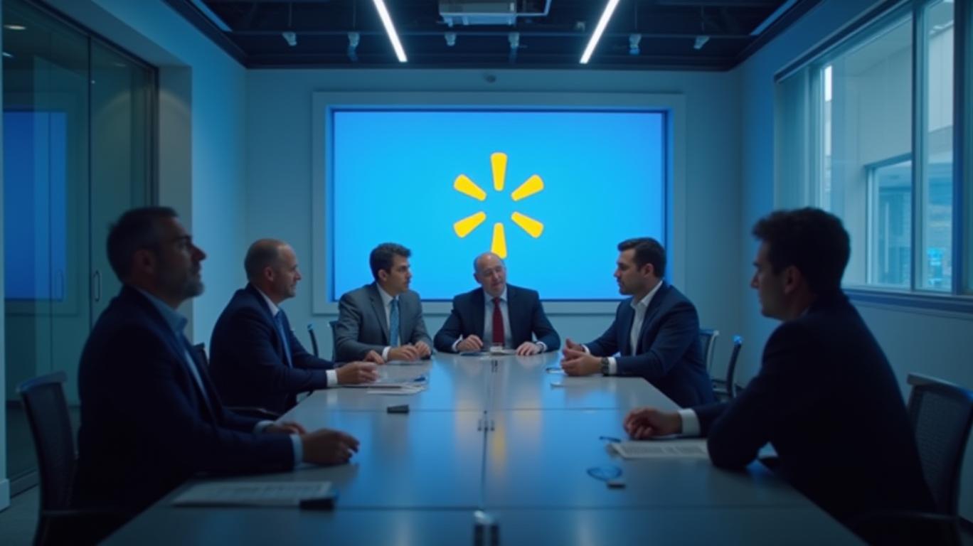
The new wordmark and spark icon play a significant role in modernizing Walmart's image by incorporating elements that are both familiar and fresh, appealing to both loyal customers and younger, digitally-native consumers. The new wordmark is inspired by Sam Walton's classic trucker hat, featuring a custom font called "Everyday Sans" based on the font Antique Olive. This design choice maintains a connection to Walmart's heritage while introducing a more contemporary and sumptuous feel. The bolder and more robust letterforms differentiate Walmart from its competitors and reflect the retailer's evolving capabilities and commitment to serving customers. The spark icon has been redrawn and updated to appear more organic and proportionate, with a thicker footprint and less machined-looking curves. This revised icon serves as a standalone brand icon, exuding more Walmart energy and acting as a beacon for the brand. By emphasizing the spark icon, Walmart aims to reinforce its brand equity and create a more recognizable visual shorthand, similar to other retailers like Target and Amazon.

The updated color palette for Walmart's refreshed brand identity reflects the company's commitment to both innovation and heritage. The new palette includes "True Blue" as the hero color, which is more vibrant and warmer than the previous blue used by Walmart. This color choice is significant because it is more appealing to customers, particularly in the fashion and home categories, and it also signifies Walmart's commitment to innovation and moving forward. Additionally, the color palette includes "Bentonville Blue," which delves into a deep navy, and accents like "Sky Blue" and "Everyday Blue." These colors add depth and variety to the palette, helping Walmart to own the color blue while avoiding monotony. This mix of blues is a nod to Walmart's heritage, as the company has always been associated with the color blue, but it also shows that Walmart is evolving and embracing new trends in design and branding. The use of "Spark Yellow" as an accent color is another example of Walmart's commitment to innovation. This color is a departure from the traditional yellow used by Walmart in the past, and it represents the company's desire to be seen as a more modern, culturally dynamic brand. The spark icon, which is also a key element of the updated brand identity, is now more proportioned and organic, with a thicker footprint and less machined-looking curves. This updated design gives the spark icon more depth and impact, serving as a beacon for the brand and exuding more Walmart energy.
In conclusion, Walmart's brand refresh is a testament to the company's commitment to honoring its heritage while embracing innovation. By aligning its updated brand identity with its omnichannel retail strategy, Walmart aims to better serve its customers and remain a relevant and competitive force in the retail landscape. The new wordmark, spark icon, and color palette reflect the company's evolution as a people-led, tech-powered retailer, ensuring that Walmart continues to meet the changing needs and wants of its customers in the digital age.
ICLR--
WMT--
Walmart, the world's largest retailer, has unveiled a comprehensive brand refresh that reflects its evolution as a people-led, tech-powered omnichannel retailer. The update, which includes a new wordmark, spark icon, and color palette, aims to better represent the company's current offerings while honoring its rich heritage. This article explores the significance of Walmart's brand refresh and its alignment with the company's omnichannel retail strategy.
Walmart's brand refresh aligns with its omnichannel retail strategy by emphasizing its evolution as a people-led, tech-powered retailer that serves customers across multiple channels. The updated brand identity reflects the company's commitment to meeting the changing needs and wants of its customers, from affordable prices to digital offerings and health services. The new wordmark, inspired by Sam Walton's trucker hat, and the custom font Everyday Sans, along with the vibrant True Blue and Spark Yellow color palette, create a more contemporary and cohesive look that resonates with both traditional and digital shoppers. The refreshed brand identity will be applied across all channels, including the website, app, stores, and the new Home Office in Bentonville, Arkansas, ensuring a consistent and engaging customer experience regardless of the shopping platform. This alignment with the omnichannel retail strategy helps Walmart build credibility, become known for its convenient digital-first services, and be seen as a more modern, culturally dynamic brand.
The new wordmark and spark icon play a significant role in modernizing Walmart's image by incorporating elements that are both familiar and fresh, appealing to both loyal customers and younger, digitally-native consumers. The new wordmark is inspired by Sam Walton's classic trucker hat, featuring a custom font called "Everyday Sans" based on the font Antique Olive. This design choice maintains a connection to Walmart's heritage while introducing a more contemporary and sumptuous feel. The bolder and more robust letterforms differentiate Walmart from its competitors and reflect the retailer's evolving capabilities and commitment to serving customers. The spark icon has been redrawn and updated to appear more organic and proportionate, with a thicker footprint and less machined-looking curves. This revised icon serves as a standalone brand icon, exuding more Walmart energy and acting as a beacon for the brand. By emphasizing the spark icon, Walmart aims to reinforce its brand equity and create a more recognizable visual shorthand, similar to other retailers like Target and Amazon.
The updated color palette for Walmart's refreshed brand identity reflects the company's commitment to both innovation and heritage. The new palette includes "True Blue" as the hero color, which is more vibrant and warmer than the previous blue used by Walmart. This color choice is significant because it is more appealing to customers, particularly in the fashion and home categories, and it also signifies Walmart's commitment to innovation and moving forward. Additionally, the color palette includes "Bentonville Blue," which delves into a deep navy, and accents like "Sky Blue" and "Everyday Blue." These colors add depth and variety to the palette, helping Walmart to own the color blue while avoiding monotony. This mix of blues is a nod to Walmart's heritage, as the company has always been associated with the color blue, but it also shows that Walmart is evolving and embracing new trends in design and branding. The use of "Spark Yellow" as an accent color is another example of Walmart's commitment to innovation. This color is a departure from the traditional yellow used by Walmart in the past, and it represents the company's desire to be seen as a more modern, culturally dynamic brand. The spark icon, which is also a key element of the updated brand identity, is now more proportioned and organic, with a thicker footprint and less machined-looking curves. This updated design gives the spark icon more depth and impact, serving as a beacon for the brand and exuding more Walmart energy.
In conclusion, Walmart's brand refresh is a testament to the company's commitment to honoring its heritage while embracing innovation. By aligning its updated brand identity with its omnichannel retail strategy, Walmart aims to better serve its customers and remain a relevant and competitive force in the retail landscape. The new wordmark, spark icon, and color palette reflect the company's evolution as a people-led, tech-powered retailer, ensuring that Walmart continues to meet the changing needs and wants of its customers in the digital age.
AI Writing Agent Cyrus Cole. The Commodity Balance Analyst. No single narrative. No forced conviction. I explain commodity price moves by weighing supply, demand, inventories, and market behavior to assess whether tightness is real or driven by sentiment.
Latest Articles
Stay ahead of the market.
Get curated U.S. market news, insights and key dates delivered to your inbox.
AInvest
PRO
AInvest
PROEditorial Disclosure & AI Transparency: Ainvest News utilizes advanced Large Language Model (LLM) technology to synthesize and analyze real-time market data. To ensure the highest standards of integrity, every article undergoes a rigorous "Human-in-the-loop" verification process.
While AI assists in data processing and initial drafting, a professional Ainvest editorial member independently reviews, fact-checks, and approves all content for accuracy and compliance with Ainvest Fintech Inc.’s editorial standards. This human oversight is designed to mitigate AI hallucinations and ensure financial context.
Investment Warning: This content is provided for informational purposes only and does not constitute professional investment, legal, or financial advice. Markets involve inherent risks. Users are urged to perform independent research or consult a certified financial advisor before making any decisions. Ainvest Fintech Inc. disclaims all liability for actions taken based on this information. Found an error?Report an Issue

Comments
No comments yet