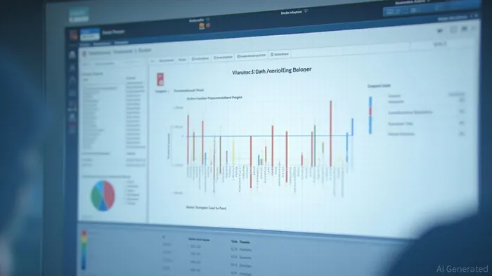
Driving Custom Variance Colors in SAP SAC via Calculated Measures in Numeric Point Charts
SAP Analytics Cloud (SAC) allows users to visualize differences between measure versions or temporal data points. The platform's dynamic variance capabilities provide contextual responsiveness, automatically recalculating variance metrics when underlying measures within the visualization are modified. To drive custom variance colors in SAC based on calculated measures in numeric point charts, users can add restricted measures, define variance measures, set up thresholds, and enable thresholds via trellis. This approach enhances custom visualization aesthetics and improves data interpretation through strategic color coding aligned with business thresholds and performance indicators.
SAP Analytics Cloud (SAC) offers robust capabilities for visualizing differences between measure versions or temporal data points, supporting dynamic variance calculations. This feature enhances the analytical workflow and decision-making process by providing contextual responsiveness. The platform automatically recalculates variance metrics when underlying measures within the visualization are modified, ensuring that variance displays remain current and accurate [NUMBER 1].To drive custom variance colors in SAC based on calculated measures in numeric point charts, users can follow a structured approach. First, users add a chart and set its type to Numeric Point. They then select the primary account, which can be either a parent or a leaf account. Next, they add restricted measures based on version and date, such as Actuals 2025 and Budget 2025. These restricted measures serve as the foundation for defining variance measures, which compare values between actuals and budget.
To set up thresholds, users create rules that filter on the calculated measures. For instance, one rule can assign green to positive values and red to negative values, while another rule can reverse these colors. By enabling thresholds via trellis, users can drive variance colors based on the calculated measure filters set up in the background. This approach not only enhances custom visualization aesthetics but also improves data interpretation through strategic color coding aligned with business thresholds and performance indicators.
By leveraging calculated measures and trellis-based thresholds, SAP SAC users can dynamically drive custom variance colors in numeric point charts. This empowers more intuitive and immediate visual insights into performance deviations, resulting in a more engaging and effective analytical experience aligned with organizational KPIs.
References:
[1] https://community.sap.com/t5/technology-blog-posts-by-members/driving-variance-colors-in-sac-based-on-calculated-measures-in-numeric/ba-p/14149782

Stay ahead of the market.
Get curated U.S. market news, insights and key dates delivered to your inbox.

Comments
No comments yet