
Cracker Barrel's Logo Change Sparks Backlash Amid Modernization Efforts
Cracker Barrel, a prominent American casual dining chain, recently unveiled a new logo as part of a broader brand modernization effort. The new design, which removes the iconic "barrel" and "figure" elements that have been central to the brand since 1977, was intended to align more closely with the brand's signature barrel outline. However, the change was met with significant backlash from loyal customers and conservative groups, who viewed it as a departure from the company's traditional roots.
The new logo is part of a 700 million dollar transformation plan aimed at shedding the brand's outdated image and attracting new customers. The plan includes the launch of new television advertisements, redesigned menus, and the introduction of seasonal menu items. The company's CEO had previously emphasized the importance of updating the brand's communication methods, menu offerings, and store aesthetics to regain market attention.
Despite the company's efforts to modernize, the new logo has sparked criticism from some loyal customers who feel that the brand is straying from its traditional, rustic charm. Social media users have expressed their dismay, with some commenting that the logo change feels like another piece of cultural heritage being lost. The change has also drawn the ire of conservative figures, who see it as a move away from the brand's traditional values.
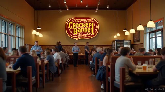
In addition to the logo change, Cracker BarrelCBRL-- is also renovating some of its 660-plus locations. The renovations include removing rustic decor and dark wood finishes, replacing them with brighter, more modern interiors. The response to these changes has been mixed, with some customers appreciating the updates while others lament the loss of the brand's traditional atmosphere.
The CEO remains optimistic about the changes, stating that the majority of feedback has been positive. However, a marketing professor noted that the brand's reimagining could confuse customers, particularly given the high recognition value of the original logo and store decor. The professor warned that if the company misjudges the market or fails to effectively communicate the changes, it could face further backlash. The new logo, while retaining the brand's color scheme, risks diluting the brand's unique identity and emotional connection with consumers.
The company's recent financial report highlighted the challenges faced by the restaurant industry, including a 5 million dollar loss due to tariffs on imported goods. Despite this, the company's restaurant revenue and same-store sales showed modest growth, aligning with trends seen in other casual dining chains. The logo change and subsequent backlash serve as a reminder of the delicate balance companies must strike between modernization and maintaining customer loyalty, especially in an era where social media can rapidly amplify public sentiment.
Stay ahead of the market.
Get curated U.S. market news, insights and key dates delivered to your inbox.

Comments
No comments yet