The Volatility Smile chart plots implied volatility (IV) against strike price for one or more expiration dates. The resulting curve typically forms a "smile" or "skew" shape, revealing how the market assigns different risk premiums to options at different price levels. Understanding this shape is essential for evaluating whether an option is relatively cheap or expensive compared to its neighbors.
Where to Find It
On the web: Navigate to https://www.ainvest.com/etfs/ARCA-SPY/options/, select the Volatility tab, and look for the Volatility Smile section.
On mobile: Open the ticker page, tap Options, then select the Analysis sub-tab. Scroll down past the Strike Price section to find the Volatility Smile chart.
Platform differences: The mobile experience offers richer interactivity. You can overlay multiple expiration dates on the same chart -- for example, Jan 30, Feb 02, Feb 04, and Feb 06 displayed simultaneously in different colors. The chart also includes a toggle to filter by Average, Call, or Put IV.
Mobile Analysis view showing the volatility section with smile chart and expiration toggles
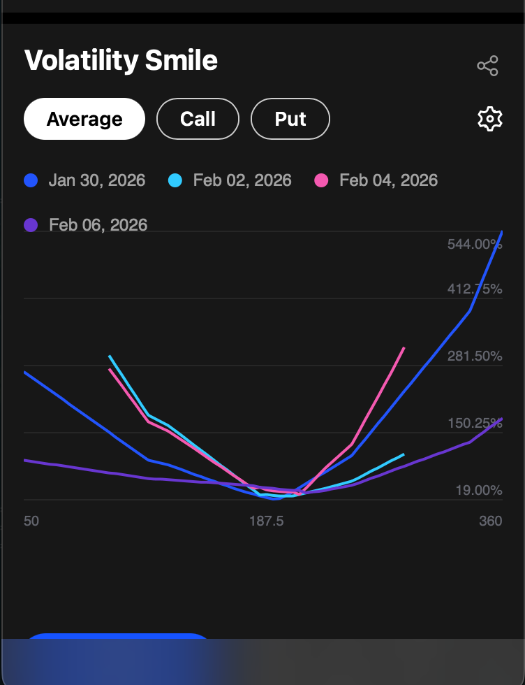
Volatility Smile chart showing implied volatility plotted against strike price with multiple expiration dates overlaid in different colors
How It Works
The chart displays the following elements:
- Y-axis: Implied volatility as a percentage (e.g., 19% to 544%)
- X-axis: Strike prices spanning the available range (e.g., $50 to $360 for NVDA)
- Colored lines: Each line represents a different expiration date, overlaid for comparison (blue, cyan, pink, purple)
- Toggle controls: Switch between Average, Call, and Put views to see combined or separated IV
- Settings and sharing: Use the gear icon to configure the chart and the share icon to export
How to Read the Data
The "Smile" Shape
At-the-money (ATM) options -- those with strike prices near the current stock price -- typically have the lowest IV. As you move further out-of-the-money (OTM) in either direction, IV rises. Deep OTM puts appear on the left side of the chart, deep OTM calls on the right. When both sides curve upward, the pattern forms the characteristic "smile."
Skew vs. Smile
In practice, equity options more often show a skew rather than a symmetric smile. The left side of the curve (OTM puts) tends to have higher IV than the right side (OTM calls). This asymmetry reflects the market's tendency to price downside protection at a premium. Crash risk -- the possibility of sudden, large declines -- makes put buyers willing to pay more, driving up IV on the left side of the chart.
Comparing Expirations
Shorter-dated expirations often show a steeper smile or skew than longer-dated ones. If a near-term expiration suddenly displays much higher IV than normal relative to other expirations, it likely indicates an expected event such as an earnings announcement, FDA decision, or major economic release. This is one of the most actionable signals the Volatility Smile chart provides.
Earnings-Driven Skew
Before earnings announcements, the volatility smile typically steepens dramatically. Traders pay up for protective puts ahead of potential downside surprises, driving put IV higher. Simultaneously, speculative call buying can elevate call IV. The result is a much steeper and more pronounced skew than during normal market conditions. After the earnings announcement, the skew typically flattens as event uncertainty resolves.
Extreme IV at Far OTM Strikes
Very far OTM options can display extremely high IV percentages -- sometimes exceeding 500%. This is partly a mathematical artifact: when an option's absolute price is very small, even minor changes in value translate into large percentage shifts in implied volatility. Exercise caution when interpreting IV at the extreme ends of the strike range. The most reliable readings are near the ATM zone.
Practical Example
Consider NVDA with four expiration dates displayed on the Volatility Smile chart. The Jan 30 curve (0DTE, shown in blue) is dramatically steeper than the Feb 06 curve (shown in purple). At the $50 strike, IV for the 0DTE expiration exceeds 500%, compared to roughly 150% for Feb 06. This is expected behavior: zero-days-to-expiration options carry extreme gamma, making far-OTM strikes extraordinarily sensitive to any price movement.
The key insight appears near the ATM zone, around the $187.50 area. Here, IV across all four expirations converges to a narrow range of approximately 19-25%. This confirms that ATM options offer the most "fair" pricing relative to the market's expected movement -- the smile effect is minimal at-the-money and intensifies as you move away from the current price.
Tips for Using the Volatility Smile
- Spot term structure anomalies. Compare the smile across nearby expirations. If one expiration's ATM IV is significantly higher than the others, it likely brackets an expected catalyst event.
- Diagnose the source of skew. Use the Call/Put toggle to determine whether skew is driven primarily by put demand (indicating downside hedging activity) or call demand (indicating upside speculation). This distinction affects strategy selection.
- Watch for a flattening smile. When the skew becomes less pronounced -- the difference between OTM and ATM IV narrows -- it can indicate that the market is less concerned about tail risk. A steepening smile signals the opposite.
- Focus on the ATM zone for fair-value reads. ATM IV is the most liquid and least distorted data point. Use it as your baseline when evaluating whether specific strikes are relatively cheap or expensive.
Try it on Ainvest: Open the Volatility Smile — compare IV across strike prices for any ticker.