What Is the Flows Monitor Chart?
The Flows Monitor is an intraday chart that visualizes aggregate options volume — broken out by calls and puts — alongside the underlying asset's price movement. It provides a bird's-eye view of how options flow is shifting throughout the trading day, making it easy to spot divergences between volume and price, identify sentiment shifts, and track the maximum pain level.
Where to Find It
- Web: Navigate to https://www.ainvest.com/options/. The Flows Monitor occupies the top panel of the Options landing page. It is also available on individual Option Ticker Pages (for example,
/options/ARCA-SPY/), where a sidebar shows recent individual trades alongside the chart.
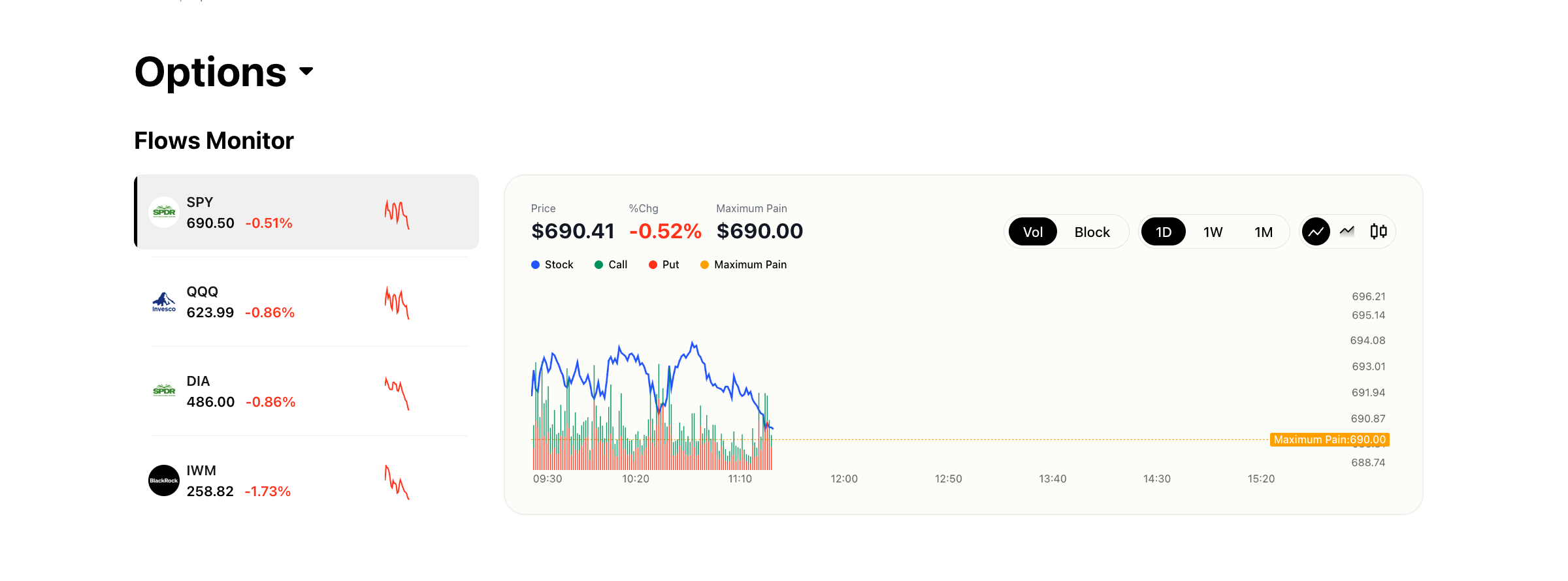
Web Flows Monitor showing SPY/QQQ/DIA/IWM ticker cards with intraday call and put flow chart, max pain line, Vol/Block toggle, and 1D/1W/1M timeframes
- Mobile: Open the Market tab, then tap Options. The Market Trend section displays a simplified summary with key metrics for major index ETFs. The mobile version prioritizes quick readability over the full interactive chart experience.
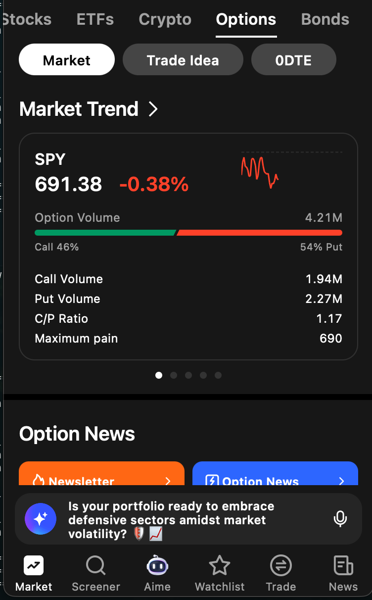
Mobile Market Trend section showing simplified flows view with C/P ratio and max pain for major index ETFs
How It Works (Web)
Left Sidebar
The left sidebar pins major index ETFs for quick access: SPY, QQQ, DIA, and IWM. Each entry shows the current price, percentage change for the day, and a sparkline chart. Click any ticker to load its flow data into the main chart area. You can also search for and select any optionable ticker.
Main Chart Area
The chart overlays several data layers:
- Stock price line (blue): The intraday price of the underlying asset.
- Call volume area/bars (green): Aggregate call option volume at each time interval.
- Put volume area/bars (red): Aggregate put option volume at each time interval.
- Maximum Pain line (orange dashed): The price level at which the maximum number of option contracts would expire worthless. This is the theoretical point of least financial exposure for option sellers.
Chart Controls
- Vol / Block toggle: "Vol" displays aggregate volume from all trade sizes. "Block" filters the data to show only block-sized trades, removing smaller retail orders and isolating institutional activity.
- Timeframe selector: Choose between 1D (intraday), 1W (one week), and 1M (one month) views to analyze flow on different horizons.
- Chart type toggle: Switch between a line chart and a candle chart for the price data.
- 0D toggle: Filter the volume data to show only zero-DTE (zero days to expiration) options. This isolates the most short-term, speculative activity.
Data Display
Above the chart, a summary bar shows the current price, percentage change, and the maximum pain value for the selected ticker and expiration.
How It Works (Mobile — Market Trend)
The mobile experience presents swipeable cards for SPY, QQQ, DIA, and IWM. Each card includes:
- Current price and percentage change
- A sparkline chart
- Total option volume
- A proportional call/put volume bar (green for calls, red for puts)
- Individual call volume and put volume figures
- Call/Put (C/P) ratio
- Maximum Pain value
Tapping a card navigates to that ticker's full detail page, where you can access the option chain and other tools.
How to Read the Data
Call vs. Put Volume
When call volume significantly exceeds put volume, market participants may be positioning for upward movement in the underlying asset. When put volume dominates, the flow suggests bearish sentiment or active hedging. Neither signal is definitive on its own — context matters. A surge in put volume on a day with positive price action could indicate protective hedging rather than a bearish bet.
Maximum Pain
Maximum pain represents the price at which the total value of all outstanding options (both calls and puts) would cause the maximum financial loss to option holders and the minimum loss to option sellers. Stock prices often gravitate toward the maximum pain level as expiration approaches, particularly on weekly and monthly expiration Fridays. This tendency, sometimes called "pinning," occurs because market makers who have sold options may hedge in ways that push the stock toward that price.
Vol View vs. Block View
The Vol view includes all trade sizes, giving you a complete picture of market activity. The Block view filters out smaller retail trades and shows only institutional-sized orders. Comparing the two can reveal whether institutional sentiment aligns with or diverges from overall market sentiment.
Practical Example
Suppose SPY is trading at $691 on a Thursday morning. The Flows Monitor shows steady, balanced call and put volume through the first hour of trading. Then, around 10:30 AM, a noticeable spike appears in call volume — the green bars surge while the stock price has barely moved. You switch to the Block view and see that the spike is driven by several large call purchases concentrated around the $695 strike.
This divergence between flow and price is worth noting. The options market is showing aggressive bullish positioning while the stock has not yet reacted. It could indicate that institutional buyers are positioning ahead of an expected catalyst — perhaps an afternoon Fed announcement or an upcoming earnings report. You might use this information to investigate further by checking the Block Monitor for details on those individual trades or reviewing the Unusual Activity Monitor on SPY's ticker page.
Tips for Using the Flows Monitor Chart
- Compare Vol and Block views. If block flow is bullish but overall volume is mixed, institutional and retail sentiment may be diverging. Institutional flow tends to be a more reliable signal.
- Use the 1W timeframe to determine whether today's flow continues a multi-day trend or represents a reversal. A single day of bullish flow after four bearish days tells a different story than five consecutive bullish days.
- Watch for maximum pain convergence. As expiration approaches, pay attention to whether the stock price is drifting toward the max pain level. If it is, options near max pain may behave differently than those far from it.
- Use the 0D toggle on expiration days. Zero-DTE options carry unique dynamics — high gamma and rapid time decay — and filtering for them can reveal short-term speculative sentiment that gets lost in the broader volume data.
Try it on Ainvest: Open the Flows Monitor — track real-time call and put flow alongside price action.