
Walmart's Logo Reboot: A Fresh Look for a Retail Giant
Generado por agente de IAWesley Park
lunes, 13 de enero de 2025, 7:04 pm ET1 min de lectura
CASK--
Walmart, the retail behemoth that has been a staple in American shopping for decades, has finally given its iconic logo a makeover. The new logo, unveiled on January 13, 2025, is a departure from the classic design that has been a symbol of the company's commitment to affordable prices and customer service. But is the new logo a step in the right direction, or a misstep for the retail giant?
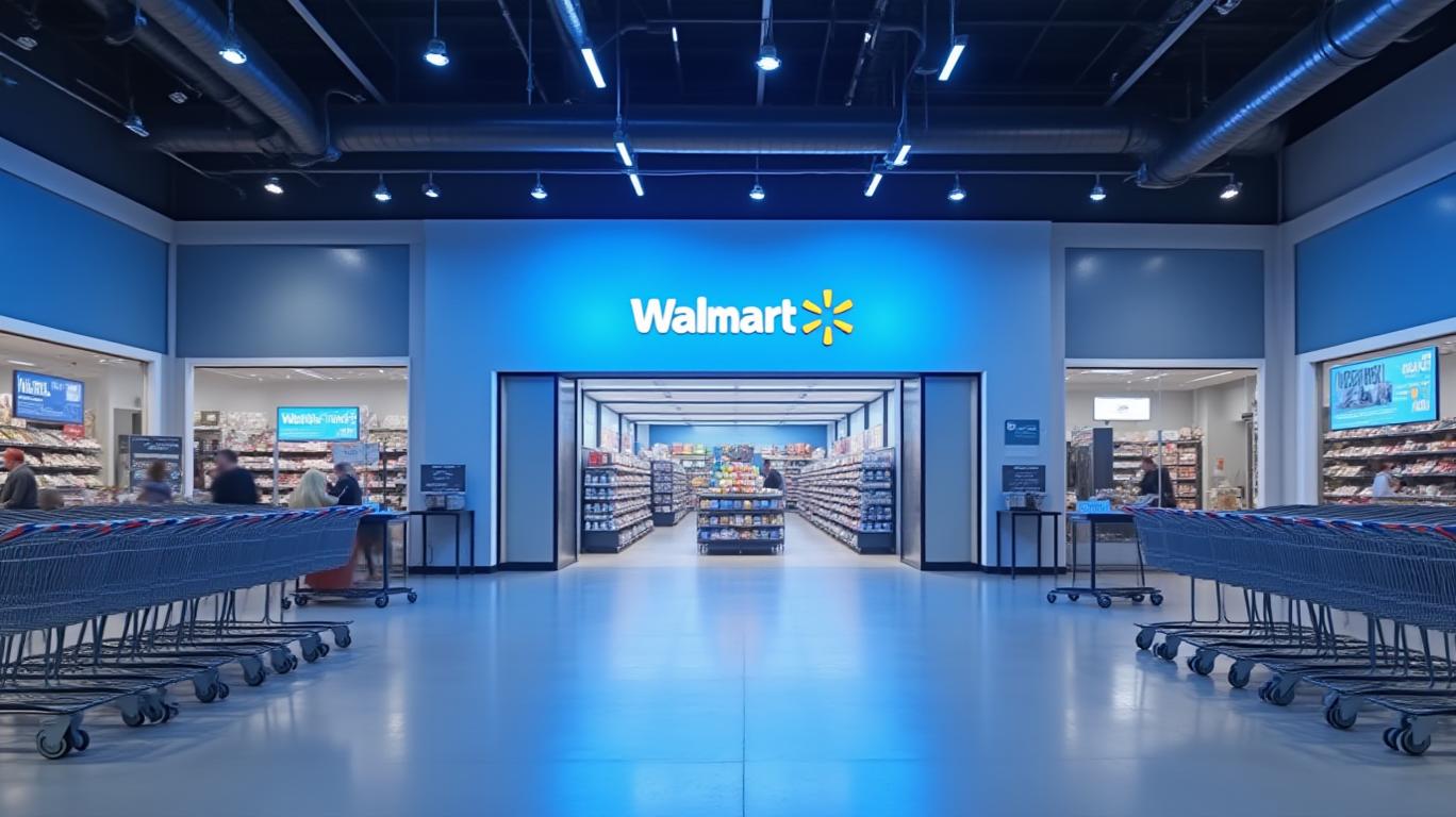
The new logo features a modern, custom font that differentiates Walmart from its competitors. The wordmark is inspired by Sam Walton's classic trucker hat, a nod to the company's heritage and founder. The spark, a well-known symbol of the brand, remains a beacon that guides customers through all facets of the Walmart experience. The color palette, True Blue and Spark Yellow, leans on the retailer’s most recognizable tones and its heritage of blue, while ushering in new updates to keep the brand fresh.
The refreshed brand identity is a strategic move by Walmart to appeal to a broader customer base. By making the brand more contemporary, relatable, and approachable, Walmart aims to connect with a wider range of customers, particularly younger generations who prefer modern design aesthetics. The new logo is a clear indication that Walmart is committed to evolving with the times and staying relevant in the ever-changing retail landscape.
However, the new logo has not been without its critics. Some customers have taken to social media to express their disapproval of the updated design, with many preferring the classic logo that has become synonymous with the Walmart brand. While it is understandable that some customers may be resistant to change, it is important for Walmart to continue to innovate and adapt in order to remain competitive in the market.
In conclusion, Walmart's logo reboot is a bold move that reflects the company's commitment to staying relevant and appealing to a broader customer base. While some customers may be resistant to change, the new logo is a clear indication that Walmart is dedicated to evolving with the times and continuing to provide affordable prices and exceptional customer service. As Walmart continues to grow and adapt, it is important for the company to maintain its focus on its core values and principles, while also embracing the future.
WMT--
Walmart, the retail behemoth that has been a staple in American shopping for decades, has finally given its iconic logo a makeover. The new logo, unveiled on January 13, 2025, is a departure from the classic design that has been a symbol of the company's commitment to affordable prices and customer service. But is the new logo a step in the right direction, or a misstep for the retail giant?
The new logo features a modern, custom font that differentiates Walmart from its competitors. The wordmark is inspired by Sam Walton's classic trucker hat, a nod to the company's heritage and founder. The spark, a well-known symbol of the brand, remains a beacon that guides customers through all facets of the Walmart experience. The color palette, True Blue and Spark Yellow, leans on the retailer’s most recognizable tones and its heritage of blue, while ushering in new updates to keep the brand fresh.
The refreshed brand identity is a strategic move by Walmart to appeal to a broader customer base. By making the brand more contemporary, relatable, and approachable, Walmart aims to connect with a wider range of customers, particularly younger generations who prefer modern design aesthetics. The new logo is a clear indication that Walmart is committed to evolving with the times and staying relevant in the ever-changing retail landscape.
However, the new logo has not been without its critics. Some customers have taken to social media to express their disapproval of the updated design, with many preferring the classic logo that has become synonymous with the Walmart brand. While it is understandable that some customers may be resistant to change, it is important for Walmart to continue to innovate and adapt in order to remain competitive in the market.
In conclusion, Walmart's logo reboot is a bold move that reflects the company's commitment to staying relevant and appealing to a broader customer base. While some customers may be resistant to change, the new logo is a clear indication that Walmart is dedicated to evolving with the times and continuing to provide affordable prices and exceptional customer service. As Walmart continues to grow and adapt, it is important for the company to maintain its focus on its core values and principles, while also embracing the future.
Divulgación editorial y transparencia de la IA: Ainvest News utiliza tecnología avanzada de Modelos de Lenguaje Largo (LLM) para sintetizar y analizar datos de mercado en tiempo real. Para garantizar los más altos estándares de integridad, cada artículo se somete a un riguroso proceso de verificación con participación humana.
Mientras la IA asiste en el procesamiento de datos y la redacción inicial, un miembro editorial profesional de Ainvest revisa, verifica y aprueba de forma independiente todo el contenido para garantizar su precisión y cumplimiento con los estándares editoriales de Ainvest Fintech Inc. Esta supervisión humana está diseñada para mitigar las alucinaciones de la IA y garantizar el contexto financiero.
Advertencia sobre inversiones: Este contenido se proporciona únicamente con fines informativos y no constituye asesoramiento profesional de inversión, legal o financiero. Los mercados conllevan riesgos inherentes. Se recomienda a los usuarios que realicen una investigación independiente o consulten a un asesor financiero certificado antes de tomar cualquier decisión. Ainvest Fintech Inc. se exime de toda responsabilidad por las acciones tomadas con base en esta información. ¿Encontró un error? Reportar un problema

Comentarios
Aún no hay comentarios